Side-by-side or overlay PDF diff driven by one engine that reads each file into a structured model — text, vector geometry, images, form fields, annotations — and compares the models. Moves show as moves, edits show only where they happened, and any PDF type works without picking a mode.
Open a STEP / STP part and it measures itself — volume, thinnest wall, draft and undercut checks on load, plus hole detection with a BOM. Measure, section, export STL. Rust + WASM B-rep kernel, runs in your browser.
A PDF has no words, only glyphs in places, so we rebuild them
A PDF stores glyphs at positions, not words or paragraphs. A text compare rebuilds the words first, and that rebuild is where many compare errors start.
Select a sentence in a PDF viewer and it behaves like text: it highlights word by word and copies with its spaces. The viewer rebuilt that. The file holds something plainer.
A PDF stores glyphs at positions. It does not store words, lines or paragraphs. Every tool that compares the text of two PDFs has to rebuild those from the positions first, and only then can it say what changed. Most comparison errors start in that rebuild, not in the comparison itself. This post walks through the rebuild level by level: the rule each level uses, and the real files that test it.
What the file holds
A glyph is the drawn shape of a character in a particular font. A PDF page’s content says, in effect, “use this font at this size, move to this point, draw these glyphs”. A reader library such as pdf.js returns that content as text items. Each item has a string, a position, a width and a height, in points (pt), where 1 pt is 1/72 of an inch.
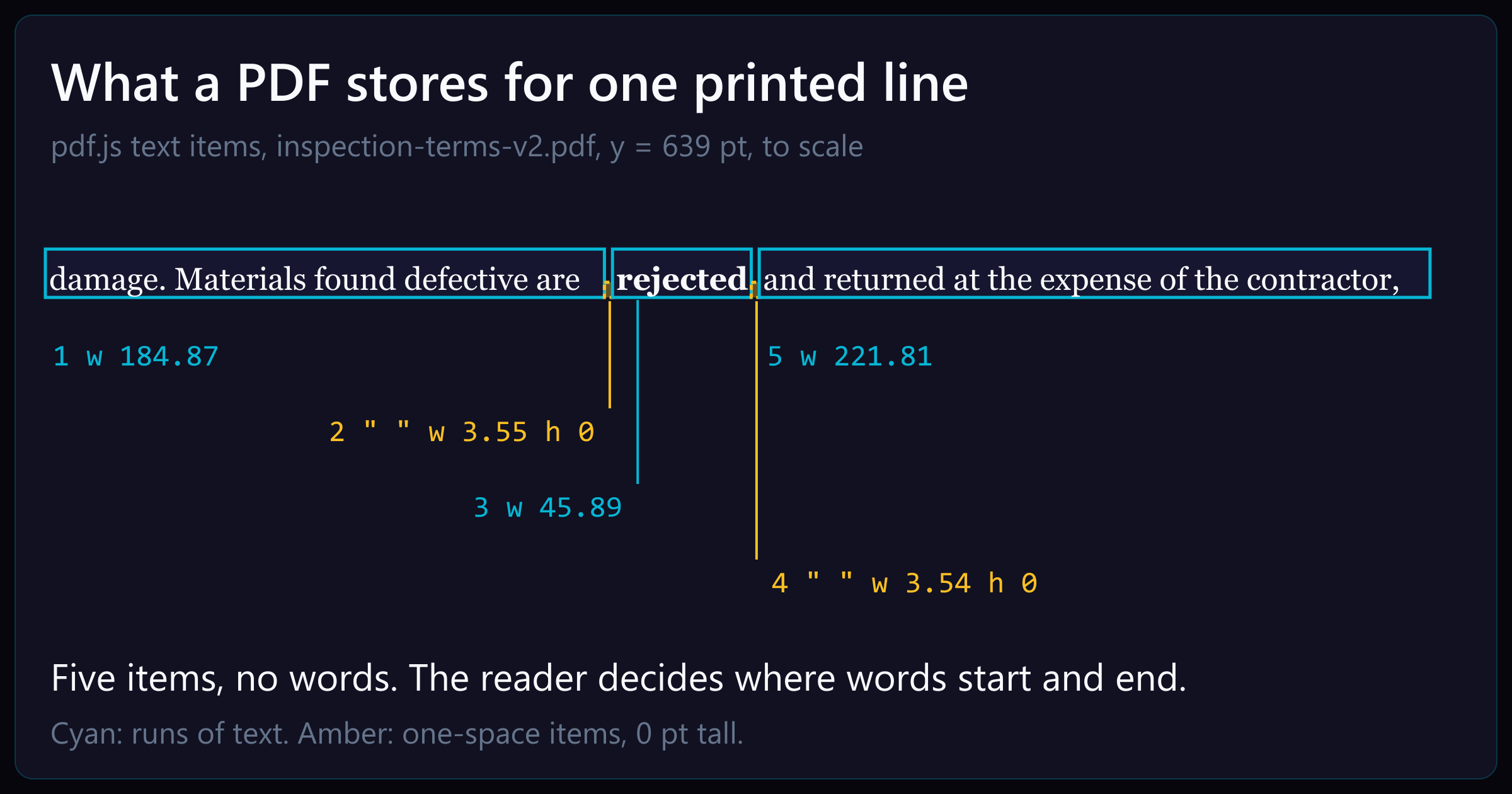
This is one line from a Chrome-printed notice, as pdf.js returns it:
{"s":"damage. Materials found defective are","x":72,"y":639,"size":10.99,"w":184.87,"h":10.99}{"s":" ","x":256.87,"y":639,"size":10.99,"w":3.55,"h":0}{"s":"rejected","x":259.54,"y":639,"size":10.99,"w":45.89,"h":10.99}{"s":" ","x":305.42,"y":639,"size":10.99,"w":3.54,"h":0}{"s":"and returned at the expense of the contractor,","x":308.08,"y":639,"size":10.99,"w":221.81,"h":10.99}
The line has five items. Two of them are a single space, 0 pt tall. Nothing in the file says where one word ends and the next begins. How the text is split into items is the producer’s choice. A producer is the program that wrote the PDF. In this file the line splits because “rejected” is bold, which uses a different font.
Other producers split text differently:
Chrome writes a justified line as one item per word, with wide space items between them. On one line of a two-column test page, those spaces are 11.11 pt wide.
Chrome writes Arabic as one shaped glyph per item, in left-to-right visual order, not reading order.
The rebuild, level by level
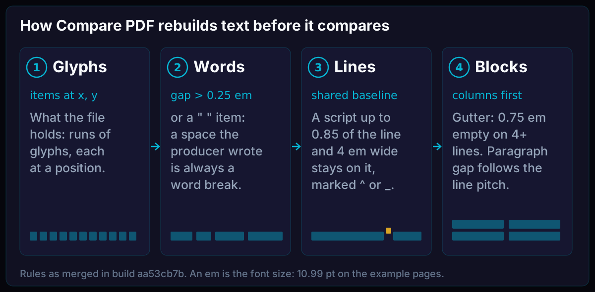
Compare PDF rebuilds text through four levels before it compares anything: glyphs, then words, then lines, then blocks. Each move up a level has a rule, and each rule is a guess about how producers lay out text.
Each level is built from the one before it, until the result is something a person would call text. Rules as of build aa53cb7b.
An em is a unit equal to the font size. On the example pages, the text is 10.99 pt, so 1 em is 10.99 pt.
Step 1: glyphs to words
Two runs of glyphs are separate words when the gap between them is wider than 0.25 em. On 10.99 pt text, that is 2.75 pt.
The line above shows why the gap alone is not enough. Without its space items, the gap between “are” and “rejected” is 2.67 pt, 0.08 pt under the threshold, and the three words run together as arerejectedand. A compare that reads the line that way cannot tell that “rejected” turned bold.
So a second rule applies: a space item always marks a word break, however narrow the gap. When a producer writes a space, Compare PDF keeps it.
Step 2: words to lines
Words on the same baseline form a line. The baseline is the invisible line that letters sit on.
Superscripts and subscripts sit off the baseline, so they test this rule. If an exponent joins its line with no mark, “10³ N” and “103 N” read the same, and a changed exponent disappears. So Compare PDF marks scripts in the text as ^ and _: “10³” reads as 10^3 and “H₂O” as H_2O, whether the file uses Unicode script characters or raised glyphs.
Browsers made the placed kind harder. Chrome sets a superscript at 1/1.2 of the line’s size. In our test page, the line is 16 pt and the exponent is 13.33 pt:
{"s":"Energy E = mc","x":72,"y":557.92,"size":16,"w":96.24}{"s":"2","x":168.25,"y":564,"size":13.33,"w":6.66}{"s":" ","x":174.91,"y":564,"size":13.33,"w":5.34}{"s":"and water is H","x":178.91,"y":557.92,"size":16,"w":92.84}{"s":"2","x":271.77,"y":553.97,"size":13.33,"w":6.66}
A size limit of 0.8 of the line’s size would miss every browser script, because 1/1.2 is about 0.83. Compare PDF uses 0.85, and a script must also be at most 4 em wide. Without the width limit, whole lines of small reference text in a real arXiv paper would read as subscripts.
Compared with a version where the exponent is 3, this page gives one change: Energy E = mc^2 became Energy E = mc^3.
Line ends test this step too. A hyphen at the end of a line splits a word across two lines, so “non- / exclusive” reads as “non- exclusive”. If the same paragraph wraps at a different place in the other version, the words look edited when they are not. So Compare PDF keeps the hyphen in the stored text but leaves it out when it decides whether two paragraphs hold the same words.
Step 3: lines to blocks
Lines become blocks: paragraphs, table cells, list items and labels. Two rules decide where a block ends.
The first rule finds columns. A reader that joins text on one baseline into one line unless the gap is wider than 2.5 em, about 27.5 pt here, fails on Chrome’s two-column test page, which has a 24 pt gutter:
{"s":"The contractor shall deliver all materials to","x":72,"y":670.5,"w":222}{"s":"and","x":318,"y":670.5,"w":18.35}{"s":" ","x":336.35,"y":670.5,"w":10.49,"h":0}{"s":"any","x":344.21,"y":670.5,"w":17.45}
Column 1 ends at 72 + 222 = 294 pt, and column 2 starts at 318 pt, so each line would join a line from each column. One edit in column 2, “ten” changed to “seven”, would come back as a change covering both columns, 468 by 261 pt, with text no one could read.
So Compare PDF finds columns before lines. A gutter is a strip of 0.75 em or more that is empty on 4 or more lines, with 12 em or more of text on each side.
The change box covers one paragraph in column 2, not both columns. Pair chrome-two-column (Chrome print), captured on build 68c79e75.
The second rule finds paragraph ends. A fixed limit, such as a gap of 1.7 times the font size between lines of one paragraph, breaks on 1.5-line or double spacing: every line is further apart than that, so every line becomes its own paragraph. Compare PDF’s gap limit follows the page’s own line pitch, the median step from one baseline to the next.
Lists fail the opposite way: consecutive items merge into one paragraph, so an added item reads as an edit inside it. So a line that breaks where the next word would still have fit, with 2 em to spare, ends its block.
Tables test both rules at once. A description that wraps differently in a parts list can read as rows removed and added. So a wrapped cell stays one cell when the first column is empty and the text sits under a cell above.
Why not read the text in the order the file gives it?
The obvious shortcut is to read the items in file order. That order belongs to the producer, and it does not always match reading order.
The Arabic test file shows this plainly. Chrome wrote one shaped glyph per item, left to right across the page. Read in that order, the sentence comes out reversed and garbled, and a changed word splits into fragments. Compare PDF reverses those items into reading order and maps each shaped glyph back to its letter with Unicode NFKC normalisation, the standard rule that turns a shaped form into the plain letter it stands for. Hebrew needs no such step, because it has no contextual shaping: its letters come through as letters, in order.
File order would not help with columns either. On the two-column test page, Chrome writes the first line of column 1, then the first line of column 2, then the second line of column 1. Read in file order, the columns interleave. Only positions can tell the two columns apart.
What this means when you compare two PDFs
Some layouts stay hard for any rebuild:
Scanned pages hold no text items at all. OCR, the step that reads text from the page image, puts each word on its own baseline, which can split and reorder lines.
Text set around a figure has its own right margin, which a column rule can mistake for a gutter.
Two columns with a narrow gutter can join when the gap does not show on enough lines.
A comparison is only as good as the text it compares. If a tool reports a change you cannot see, or misses one you can, the rebuild is the first place to look.
To see how the rebuild reads your own files, open two versions in Compare PDF.